Introduction
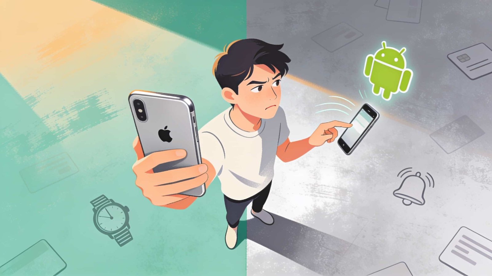
It’s getting scarily close to a year now that I’ve been using Android products. Before that I was completely neck deep in the Apple ecosystem. Since then, I’ve used phones and tablets from nearly all the main Android manufacturers, and I swap freely between iOS and Android throughout the day. There’s still plenty I love about Apple. But there are 5 things I’ve come to love about Android, so much so that I genuinely miss them the moment I pick up my iPhone.
Feature 5
At number 5 is the sheer number of options when it comes to smartwatches. With iPhones, you really only get the Apple Watch. Sure, there are Fitbits and Garmins, but those are essentially fitness trackers, even the fancier models. For actual smartwatch functionality, the Apple Watch is really the only choice that makes sense. And it’s great. But it looks the way it looks, there’s no real variety.
On the Android side, it’s a different story. A Pixel Watch looks dramatically different from a OnePlus Watch, which looks different from a Samsung watch, which looks different again from a Xiaomi watch, and so on.
Yes, you might not get the full feature set of the watch without pairing it with a phone from the same brand, but you still get most of the important ones, and it’s a clear step up from something as simple as a Fitbit. I love watches, and I love choice, and there’s definitely more choice on Android than on Apple.
Feature 4
At number 4, I have notifications. This one’s a bit complicated since every brand handles it a little differently. But overall, I find notifications on Android phones feel clearer than on iOS. I’ve never liked the morning summaries iPhones do. They don’t actually summarise anything, they just cluster a bunch of notifications together so you can’t see what’s inside them without opening each one.
I also love that Android phones have a simple button at the bottom to clear all notifications at once. It’s just notifications, when they pile up, clear them and start fresh. It all feels a lot simpler to understand on Android, and that’s exactly what notifications should be like.
Feature 3
At number 3, I’ve put the Google Discover tab, which is one of the things about Android that surprised me the most. Going into this, I thought I’d hate it. I thought it summed up everything wrong with Android: shoving ads and random content down your throat. I want to choose what’s on my phone, not have things shown to me right on my home screen.
I could not have been more wrong. It’s become one of my favourite features, and I probably flick through it at least once a day. It’s become really good at learning what kind of news and articles I’m interested in. Mine is a mix of tech news, gaming news, some film content, and general news from the BBC. Yes, there are a few ads, but they’re usually relevant enough that you barely notice them, and you do get some control over what shows up.
Blocking clickbait websites
For example, I’ve blocked content from a few websites that are painfully clickbaity in their titles and always disappointing once you actually open the article, so I blocked them. I find it really useful and enjoyable to scroll through. I also like that it’s built right into the home screen rather than tucked away inside an app.
Comparing it to the iPhone version
Technically, you can get this on iPhone through the Google app. It’s exactly the same feed and algorithm. I just find I use it far less when it’s stuck inside an app compared to simply swiping left from the home screen.
I was wrong, and I’m a big fan of the Google Discover feed now.
Feature 2
Something I do on every Android phone I use is change the home screen grid to 5 icons instead of 4, and turn the display or text size down slightly. That’s obviously personal preference, it’s just how I like things to look. You get much more on one page and more room to customise your layout the way you want. My point isn’t that a grid of 5 icons is objectively better than 4, it’s that I have the option to choose.
There are so many examples of this, from entirely different launchers to more customisation over lock screens, animations, and beyond. I don’t touch most of that myself, I like to keep things simple. But the option is there if you want it. iOS has more customisation than ever, but it’s still nowhere close to what Android offers. Even something as small as switching to a 5-icon grid makes my iPhone feel like it isn’t really mine, with those oversized, almost childlike icons. I care about this more than I expected to.
And that brings me to the top of my list: the back button. Or, I suppose, the back gesture.
Feature 1
I call it a gesture because I use the swipe, not the physical buttons. This is easily the thing I miss most whenever I pick my iPhone back up. I love Apple, I’ve been primarily an iPhone user for my entire adult life. But I’m sorry, having one consistent gesture to go back from anywhere, every single time, is just better. It just is. You can absolutely use an iPhone perfectly fine without it. But once you’re used to it, it’s so frustrating going back to an iPhone. Yes, I have to reach up to the top of the screen less, but that’s not really the point.
Becoming second nature
I think it’s more about being able to mentally forget about it entirely. It just becomes second nature. You tap what you want on screen, then swipe from the side to go back. It ties back into that natural human instinct thinking Steve Jobs talked about when he first introduced the iPhone and its touchscreen. That’s normally the thing Apple is amazing at. But with this, I think Android does it better. Every single time I pick up my iPhone now, I try to swipe in from the right edge to go back, at least once. It’s already that ingrained in me. And it happens every single day, without fail.